
I have long believed that there must be some science behind the stock market and what can predict prices, but I soon realized that the market was based on many other factors. Was I wrong in my belief? At first, I thought yes, but soon I realized that no, I was not wrong. There was some science to the prices, but as well, there were a lot of non-scientific factors affecting the market. I started to call them logical or scientific factors and emotional factors that affect prices. The logical or scientific factors can also be described as fundamental analysis. The emotional factors can be broken down into fear and greed. The reality is that the emotional factors have a much higher impact on the market than does the scientific factors. You can imagine a stream with two currents, one current on the bottom that is consistent and changes very slowly, while the upper current is dramatically larger and can change at any time, but usually concerning a stimulus. This reaction often leads to a chain reaction, which then accelerates the current that much faster. The lower current is the science part, the upper current is the emotional side. Both currents are additive, but they can move in the same direction or opposite directions. Imagine the lower current moves from left to right. This indicates rising prices. The upper current can also move in this direction and would also indicate rising prices. The upper current can also move in the opposite direction and in a way far faster than the lower current, this would result in prices dropping.
Imagine the two currents are in balance for a moment, this would result when the upper current is zero, then the sum of both currents would match the sum of the lower current. This occurs but very briefly and generally only when the upper current is going through a change of direction. Imagine that there is a marker on the lower current and another market on the upper current. These currents can spread away from each other, they can go in a positive direction or a negative direction. If both currents are in the same direction, then the prices are moving faster than they should or they are correcting from a position of being underpriced. Assume that the start position was correct pricing, not overpriced or underpriced, then they are now moving in a direction of being overpriced. If they were moving in opposite directions and the start point was correct pricing, then the pricing would be underpriced and there would be a lot of good deals in the market. In short, if the upper current is in a positive direction, then technically speaking they are becoming more overpriced, if they started from an underpriced situation, they are correcting, if not underpriced the are becoming more overpriced.
Can these two points keep moving further and further apart? One could argue that in theory, this is possible, but practically it cannot. It almost becomes like a pyramid scheme, the last buyers would be holding the stock hoping that further buyers would even buy it at higher prices. There comes a point where they are far off the science, that it cannot self sustain. This is where a correction comes into place. It is always difficult to predict with accuracy when the chain reaction will occur. There is an election happening and this could be the initial spark needed. It is important to note that the politics will not cause this correction, it is really caused by having the difference between the two currents acting for too long. The divide between the two markers, so to speak.
One can gauge the difference in the two currents by looking at the P/E ratios or looking at the Buffett Indicator. The Buffett indicator is a ratio that looks at the market cap divided by the GDP of the country. When this ratio gets too large it signifies that prices are too large and a correction is coming. If you think about the analogy earlier, the low tide can be seen as the GDP, the upper current would be the market capitalization. A ratio getting close to one indicates trouble, this means that the upper current has caused the prices to move too quickly compared to the GDP. Another way to look at this situation is by looking at the P/E ratios. Imagine a P/E ratio of 18 as being in balance, when prices increase faster than the EPS, the P/E ratio rises. If the price moves relative to EPS, then the two currents are in balance and there is no force on the waters to correct or to move back in balance. As the P/E ratios move above 30, the imbalance starts to shift, and pressure acts on that prices start to fall back. However, emotions can keep driving the price upwards, but not too long. We can look back to the last two corrections, one in 2000 and the other in 2008. Both of these had high P/E ratios and high Buffett Indicator values.
Looking at the economic environment, the next six to 12 months is very looking very precarious, to say the least. So what can you do? Let’s first investigate what is the likelihood of a stock correction. In the following analysis, we’ll see that a market correction is extremely likely. What is less likely, or harder to discern is the exact timing and the exact extent of the correction. How can we say that a correction will occur? If one thinks about the past, and one realizes that the stock market has been on the rise. Well, if it’s been on the rise for the last number of years.

Why won’t it continue to rise? That’s a very good question. The issue is that stocks cannot rise indefinitely or at least they cannot rise to a certain extent, without having the economy rise as well. In other words, if the stock market rises faster than the economy increases, the economy that is partially based on the companies earnings, which is a slight difference to the overall economy. But we’ll get into that one later but it’s a technical one and important to understand why it is different. If the stocks continue to rise outside of where the economy rises, then there’s going to be an issue. The imbalance can last to a certain extent, but you can imagine it as when rises faster than the economy rises, this imbalance needs correcting. The larger this imbalance becomes, the more unstable it becomes. This is a situation we are in today.
The market has risen drastically compared to where the economy is, therefore the market needs to correct some of this imbalance or remain precarious. There will always be people who believe the market should even rise further. For that reason, it will rise further. The question is when will those people start to change their tune. This is why it’s very difficult to predict exactly when, but it’s not difficult to predict that the market needs to correct itself at some point, it cannot be left uncorrected, that is what we know for sure. The market is out of line with GDP growth. One of two things has to occur for this correction to get rid of the imbalance, or the disconnect. The first is either the GDP has to rise much quicker and the price of stocks needs to rise much slower. However, the likelihood of this is extremely unlikely. The GDP will not rise to a significant effect to match the rising stock prices. It is more likely that the GDP will decrease in the next 12 months, due to the COVID-19 situation, but it’s an issue that’s going to affect the stock market.
We know that a correction will occur. How are we certain? When we look at the analysis between the price-earnings and the average price-earnings (P/E) ratio. We understand that the average P/E ratio is elevated, and this elevation cannot last. My latest book details why this cannot exist for the long term and cannot sustain itself. In short, if you take the inverse of the P/E ratio you get your rate of return. So if you have a P/E ratio of 40, the inverse of that is 2.5, and that’s a rate of return 2.5%. That’s the rate of return that you can expect with a P/E ratio of 40 it’s not a great rate of return, people would like to see rates of returns between 6% and 12%, not 2.5%. Therefore, once the P/E ratio gets to a certain extent. The likelihood or the demand to buy that will far diminish.
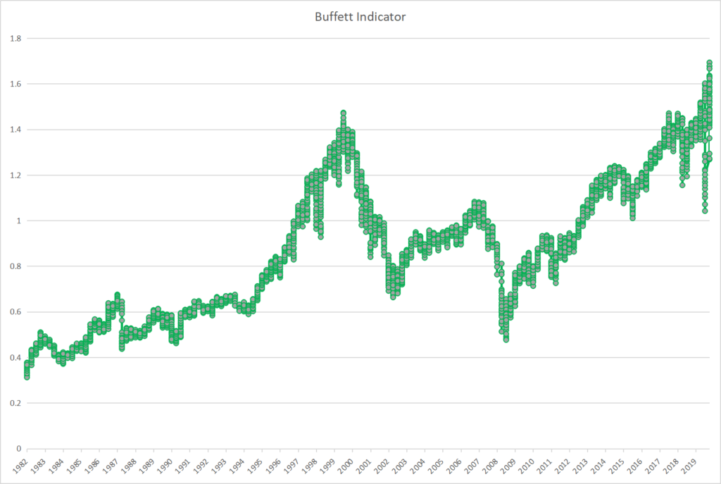
There are still going to be people who do not understand the link between the P/E ratio, and rate of return, they will assume that the prices will go up further. Now some of those assumptions will be based on the assumptions of earnings. The problem is the assumptions of earnings also is linked to GDP if you assume that earnings will go up. You’re assuming that the GDP is also going to go up. Yes, there is a difference between the two. But there’s not that dramatic difference where the average GDP or the average earnings will go differently than the direction that the GDP will go. So what does this mean in simple terms? The P/E ratio is showing a very elevated ratio and as well the Buffett indicator shows that the stocks are too elevated right now. The Buffett Indicator is the market capitalization of the stocks divided by the GDP of the country. If we look at it for the US, United States we can see that this ratio is becoming quite large and it’s very elevated in fact. For the past forty years, a ratio greater than one has indicated a high likelihood of a market correction or crash, whatever you want to call it.

The P/E ratio also shows the same thing. Now, this is not a P/E ratio for one stock because a P/E ratio for one company alone can be highly different from the P/E ratio of all the stocks. For what we’re talking about now, we’re looking at the P/E ratios of all the stocks combined on the S&P 500, but you can use any market and you will get the same scenario. You will see that the P/E ratio is overstated. One thing to understand is that the NASDAQ is an exaggeration of all the other markets. For example, if the average P/E ratio in the S&P 500 is 30. Then in NASDAQ, it might be 40 so it’s an exaggeration, of the overall markets. But you can do the same analysis for each market and you’ll come to the same conclusion that the P/E ratio shows an elevated ratio and it shows criteria that require correction.
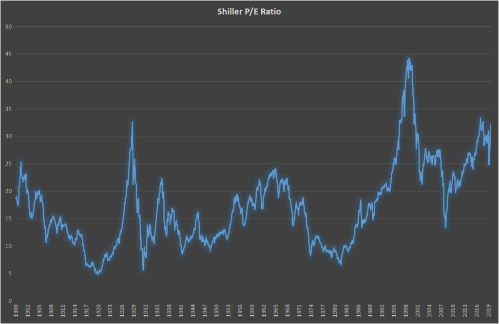
In my analysis, I consider any PE ratio above 30 to be in the initial risky phase. It’s not high risk, but it starts to be a medium risk. Anything above 35 starts to get high risk, and anything above 40 is at the extremely high-risk level, and not very sustainable in the long run. Right now we’re at a level of about, 32.5 if you look at the S&P 500 it fluctuates up and down depending on how the emotions go. If the stocks drop by a few percentage points that 32.5 will drop as well. If you lose 10% of the value that 32.5 will drop by 10%, which will then become 29.2. These are important things to consider. How much is it going to drop now if it drops some it’s kind of like letting off some steam, and then the likelihood of a crash diminishes.
You can have many smaller corrections or mini-reductions. These mini-reductions will let off some steam and let off some risk. As you will see the mini reduction causes the average P/E ratio to be reduced, which then reduces the market risk of a major correction. If you can imagine two or three mini reductions of about 10% over the next six months, then you could get a 30% reduction and that there will be reduced, perhaps to as low as 25. Then the risk of a market correction will be reduced significantly, as, as the market has slowly corrected itself, but for sure, one way or the other, whether it’s a slow decrease or a fast decrease, there will be a market correction. The interesting thing with the Buffett indicator is I’ve always felt that it’s very similar to the P/E ratio and the reason for that is the Buffett indicator is a ratio between the market capitalization of all stocks and the GDP so it’s the numerator is the market capitalization of denominators GP. Well, as if we look at the P/E ratio, the numerator is the price and the denominator is the earnings per share. Now, the price and the market cap is very similar because they are relative to each other by the number of shares outstanding. So you could say that these two are in balance as long as the number of shares remains constant and they do remain relatively constant for quite a significant period. So these two are in sync.
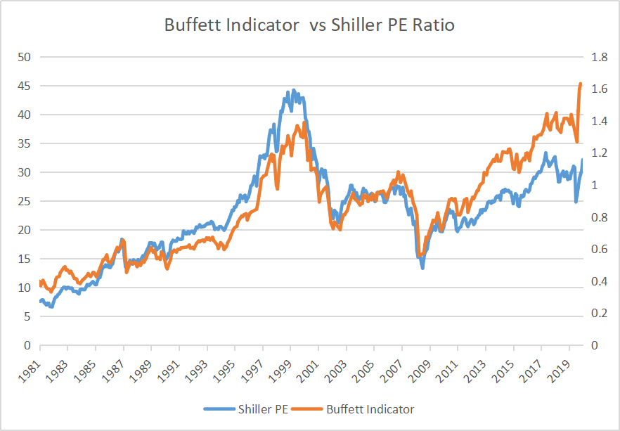
Now, the EPS and the GDP are also in sync but it’s not as clear as the sync between the price and the market capitalization. You need to understand that as the GDP rises so will the average EPS. And as the GDP falls so will the average earnings per share link is quite significant, but not 100% link other things are involved with the gap that is not involved with earnings per share. And it’s actually for this difference that, in my opinion, the P/E ratio plays a higher role or more significant role in the determination of a market correction then does the Buffett indicator. The Buffett indicator is a great idea. And it works quite well. The only issue is there comes a time when the EPS of these shares on average will very differently than the GDP. So when will this occur, it will occur when the American GDP is less in line with the world GDP than it consistently has been in the past. The stocks. The companies, earn money in the world, and their earnings play a factor in the world economy. And of course the US economy as well. But they are not completely linked with the US economy, they are partially linked with the US economy and sometimes even more linked to the world economy than the US economy. So what does this mean this means that sometimes the APS will be more related to the world GDP than it will be to the US GDP, then what happens with the Buffett indicator will play a different role it will start to become out of sync. Now let’s look at the slide below, or the chart below, you can see that for most of the years the buffet indicator and the P/E ratio were very much aligned, but then all of a sudden, after 2011, the buffet indicator starts to diverge from the P/E ratio. And it takes a higher value. And this is correlated with the US economy, versus the world economy where, while in those later years, the US economy is playing a lesser role in the world economy. And in fact, for periods the world economy is growing at a faster rate than the US economy, which would mean that the EPS has some shares of companies that can grow faster than the GDP of the United States, which would then create a disconnect between the company’s shares. And the Buffett indicator. So what that would mean is that the P/E ratio would be more relevant than the Buffett indicator, which is exactly what we’re saying. Now, if you look at the chart below you can see that the Buffett indicator would indicate that this is a serious issue right now, and in fact, it’s worse than it was in 2008. However, when you look at the P/E ratio, you can see that it is still a serious issue but it’s less than it was in the year 2000. Therefore, showing that the market correction is likely, but not extremely likely. Therefore, one can conclude that the P/E ratio, especially this P/E ratio the Shiller P/E ratio, or the cape p ratio is far better than the Buffett indicator. And that’s because the Buffett indicator or the US economy is now getting out of link with the world economy.
To find out much more, have a look at this book on Amazon. Find it here.
Alternatively, if you would like a FREE book to start – Find it here.