I will review the Buffett Indicator and compare it with the CAPE (cyclically adjusted price earnings) ratio (also knows as the Shiller P/E ratio) to find out what each tells you about the market and what we should do when the two ratios give different results. When reviewing these two ratios we can start to see a slight divergence in results, while it may seem small, the results can be quite significant. We will look at why these ratios are similar and why they are different and which should we place our reliance to determine whether a market is overpriced or underpriced. These two ratios have always been interesting for me and now that they are diverging, they are becoming even more interesting.
To clarify, I’m a big fan of Warren Buffett, in my opinion, he is very rarely wrong. Even in this case, he may end up being right. But let’s go through the analysis to see what I mean.
To understand where my thoughts come from, it’s important to get an idea of where my investment career started and how it is relevant to today. In my start, there were things that I did wrongly and things that I did correctly. It all started almost 22 years ago, it was 1999, my investment career was about to take the next steps, I started trading stocks more actively while working in Sarajevo, Bosnia. I would invest primarily in American stocks. You could say I was a day trader of sorts. I would start when the market opened, I would look at what was available, and then I would buy what was hot for that day. I would hold for a few days or a couple of weeks. Technically speaking, I was more of a swing trader than a day trader. I was clearly a trader versus an investor, this was my first mistake – of many.
The Bubble is nice while it lasts

While, I did trade every day, there is a big difference between a day trader and a swing trade, my holdings were much longer than a day. The investments usually would last anywhere from two to three days to about two months or so. Some much longer. It was quite interesting because there were certain days where I would make $2,000 profit even up to $5,000 profit in one day. The market was hot and I thought I had all the answers. Little did I know. I would soon find out that not only did I not have all the answers, but I also did not have half of the answers. This continued for months, and I did very well in the market, I made much more money than I lost. On many days, I earned more in the stock market than I did working. This was quite interesting because I would probably work on the market for about one-hour maximum and then perhaps in the evening, I would do another one to two hours of research on some random days, looking for deals that were undervalued, or stocks that were on the rise.
The Crash
Then came the crash in one instant, or let’s say over a few weeks. I lost all my profits and then some. This forced me to rethink what I did right and what I did wrong. The first thing that dawned on me is that the markets are sometimes overpriced and sometimes underpriced. It is easy to think that markets will always rise. It was clear to me, now, that the markets cannot simply go up. As the old saying goes, what goes up must come down. This is true of markets and true of stock prices, as well. I did a couple of typical mistakes. I would trade on what people would say is hot. For example, WorldCom, big mistake. I started learning all of these on my own, and also the idea of really focusing on true value stocks. This lead to the idea of understanding the market as a whole. This is what led me to Warren Buffett, what I realized is a lot of what I was learning (the hard way) was exactly what he was preaching.
If only I had learned that a few months earlier. However, while it cost me perhaps $10,000 or $20,000, in losses, on top of wiping away about $50,000 in profits, the lessons were well learned. This forced me to understand what I did right and what I did wrong. It’s much more important to learn at the beginning of your investment career, than midway or towards the end. This lesson of $20,000 could later become a loss of more than a million dollars. In one sense, that loss saved me a lot. You need to look on the bright side.
Market Valuations are Important
Later I found out I was investing in well-overpriced stocks. But the bubble was expanding and I was profiting in that expansion until it burst. It is around this time that I started looking at the Buffett indicator and as well, P/E ratios but on a whole market rather than just on one individual stock. More specifically, the CAPE ratio. The cape ratio is a cyclically adjusted P/E ratio. This is very important because this normalizes your earnings. If you think about it, the P/E ratio can fluctuate quite greatly because your earnings fluctuate significantly. The earnings will fluctuate much more than the prices will fluctuate. The P/E ratio is the share price divided by the earnings per share. If your denominator changes greatly, then your P/E ratio is going to change greatly. Yes, the price does change but it does not change as drastically as the earnings can change.
P/E Ratios
The P/E ratio is a good indicator of how well priced a stock is. Is it overpriced or is it underpriced? Generally, the ratio that I use is about 15 to 22, in that range I believe that the stock is well-priced. The lower the ratio the more underpriced and better deals. Now, of course, you have to take into account growth. Growth will play a huge factor in the P/E ratio. If there is expected growth over the next three to five years, and that growth is significant, perhaps are expecting 30% to 50% growth, in this case, the P/E ratio can be much larger.
For example, let’s say a company is earning $100 million per year and that company has 100 million shares outstanding. The EPS of that company would be $1 per share. If the price of those shares is $10, then the P/E ratio would be 10. This is the price of 10$ divided by the EPS of $1, hence 10. This is a very good P/E ratio (for investors) and generally low. Now, if this company is expected to grow, let’s give it a very high growth rate. If in four years, the earnings will grow to roughly $400 million profit per year. That would mean it would now have a projected P/E ratio, if the price remained the same at $10 divided by $4, which would be a P/E ratio of 2.5, which is extremely low. If these estimates were being seen as reasonable and accepted, then a P/E ratio of 2.5 would be too low and the price of the stock would soon jump up from $10 to about $40. This would normalize its P/E ratio to about 10 in the future but currently, it would have a P/E ratio of 40.
Growth and P/E Ratio
This is why the growth rate can have a huge effect on the P/E ratio. At the current date, its earnings are $100 million, but it is expected to grow to $400 million in four years. If these estimates are correct, once the estimate of $400 million is acceptable, the price of that share would jump up to about $40. Now, the price is $40, but the current earnings are still $100 million, therefore, it has a P/E ratio of 40. This is where the P/E ratio for companies that are in growth mode can be far higher than those that are having modest or little growth.
This can be a huge effect. This is something that needs to be taken into account and this is why, when you’re looking at one individual stock or one individual company, it’s very hard to generalize about P/E ratios, because the P/E ratio of a company that’s going to experience significant growth is going to be significantly higher than a company that is expecting modest or very little growth. This can be the difference between a P/E ratio of 400 and a P/E ratio of 10. This difference can all be explained by growth. It can be justified as long as the growth is reasonable, predictable, and likely.
Then the question can be asked, well, couldn’t this be the same for all companies? In other words, could the whole market be affected by the same growth factor?
The answer is a resounding no!
It is not reasonable to suggest or to predict that the whole market will have significant growth that one strong company can have. What does that mean? There could be a handful of companies that can be expected to have significant growth, but on general average, all companies will not have this significant growth. Most companies will see modest growth. Why is this important? This is important because when you look at the CAPE ratio, you understand there are certain limits to the CAPE ratio, especially when you look at the market as a whole.
(To find out how to invest in stocks – have a read of this article)
S&P 500
For example, if you look at the S&P 500, and you see that the CAPE ratio is 35. One cannot expect to see the S&P 500 have a cape ratio of 55 or a ratio of 400. There is no way because the expected growth that would be required to justify these ratios would not be reasonable on the market. As such, there’s a certain limit that the CAPE ratio can reach. Once it reaches that limit, there’s only one way to go.
The question now becomes, what is that limit? Understanding this is an important aspect of understanding the market and where it’s going to go, where it can go, and what happens next.
I would suggest that the limits of this ratio are dependent on the Fed rate and the expected growth in GDP, and many other factors. The lower the Fed rate, the higher the CAPE ratio can go, as well, the higher the expected growth in GDP will result in a potentially higher CAPE ratio, but everything is still limited. The theoretical maximum for a CAPE ratio across a market is likely about 45, perhaps certain conditions can justify higher, but these would not last long. Ultimately, the limit here is when most people think it is too high, and most people will think it is too high at about 45.
Buffett Indicator
The Buffett indicator is interesting, Warren Buffett uses this to determine whether the stocks are overpriced or not. This indicator is, is a ratio between the market cap of all stocks divided by the GDP. Buffett has two main points on this scale. If the ratio is below 75%, then the market is underpriced. If it’s above 90%, then the market is overpriced. Of course, if it’s below 50%, it’s severely underpriced and if it’s above 110%, it’s severely overpriced.
I found this indicator to be quite interesting. I also believe it to be correct. But here is the point where potentially Warren Buffett may have things wrong. The Warren Buffett indicator is currently at about 180%. Which would mean the stocks are extremely overpriced. I want to stress that he may be incorrect.
The first thing I find very interesting about the Buffett indicator is I’ve always found that to be very similar to the CAPE ratio. One of the things that I wanted to do and I did was map out the CAPE ratio and the Buffett indicator on the same scale.
You can see the results of this below. The reason that I wanted to map out the Buffett indicator with the cape ratio on the same scale to see what the market would say when looking at the CAPE ratio versus looking at the Buffett indicator. I have always suspected and reasoned that the two should give the same results and hence be extremely close to each other.
Buffett Indicator vs CAPE Ratio
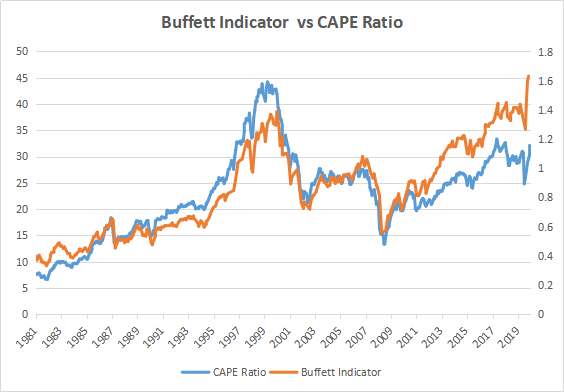
When reviewing this chart, the overlap between the two ratios is very clear. As well, you can see the ratios begin to diverge around 2013, their divergence seems to be growing each year. While there were years where these ratios diverged in the past, they have always come back together.
The first thing that led me to this belief that they were similar was when I looked at the Buffett indicator. It is the market cap, which is the price of all the stocks times the number of shares of all the stocks outstanding. That would be your numerator and the denominator is your GDP. How would this be similar to a P/E ratio? Well, the P/E ratio, the price is your numerator, and the price is related to the market cap. The only difference is the number of shares outstanding. Then how would the GDP compare with earnings? If you think about it, as the GDP rises, so should the earnings and as it drops, so should the earnings drop. So there is a definite correlation, although it’s not that easy to see. As GDP grows or as GDP falls or as GDP remains flat, this will have a huge effect on the average profits of the average company.
What is true of the goose…
This is not to say one company cannot be completely atypical. Remember we’re talking about the whole market and not one individual company. What happens in the market does not mean that happens to one individual company. However, it is important to notes that what happens in the market as a whole is likely to happen to an individual company. As an example, let’s say all the stocks as a market are overpriced by 50%, then, it is very unlikely, if you buy in this market that you’re going to find a company that’s priced correctly, most companies will likely be overpriced.

It is possible that 50% of the companies are overpriced by 100% and 50% of the companies are priced at the right amount. This is a possible scenario. Although this scenario is extremely unlikely, this scenario would be similar to flipping 100 coins, and having the first 50 coins hit heads and the next 50 coins hit tails, not very likely at all. What that means is you’re likely to get a very wide mixture, where whatever company you choose is going to be somewhat overpriced, it might be 20%, it might be 10%, or it might be 60%. Understanding the market gives you some understanding of the individual stocks. Yes, there are diamonds in the rough and if you search hard enough, you can find one that is underpriced. But in an overpriced market, the likelihood of finding an underpriced stock drops dramatically. Now when we compare the Buffett indicator versus the CAPE ratio, we can see that the correlation is extremely close. The two lines follow each other implicitly and their overlap and differences are very little.
Warren Buffett
However, we see a bit of a divergence in the later years. This small divergence is quite critical because in fact, what’s happening is the Buffett indicator is increasing faster than the CAPE ratio in more recent years.
This begs the question, is Warren Buffett wrong? There are three options here, the CAPE ratio is wrong, the Buffett indicator is wrong, or both need some tweaking. The reality is both say the same thing. Both say that stocks are overpriced. However, the cape ratio says they’re quite overpriced, and the Buffett indicator says they’re extremely overpriced.
Conclusion
In my opinion, both are primarily correct, but the Buffett indicator probably needs some adjustments. The reason for this is as companies become more global, they rely more on the global market rather than on the US market. The US GDP is growing, but not as fast as the world GDP. This could explain why the Buffett indicator is growing a little bit faster than it should. In conclusion, Warren Buffett is not wrong, but perhaps a slight adjustment to his formula may be required in this global environment.
This does not mean that the CAPE ratio is fully correct, I would argue that the real answer lies between the two ratios. The CAPE ratio has issues with it, in the current environment, but that we will address on another day. The real answer lies between these two ratios, but it is clear that the middle point still shows as the market is overpriced.
In conclusion, Warren Buffett is not wrong.
Do you think the Buffett Indicator is more correct or the CAPE ratio?
To learn more about investing download our free book below!
To find out much more on this topic and find out how it affects the stocks today, you can get this book here on Amazon